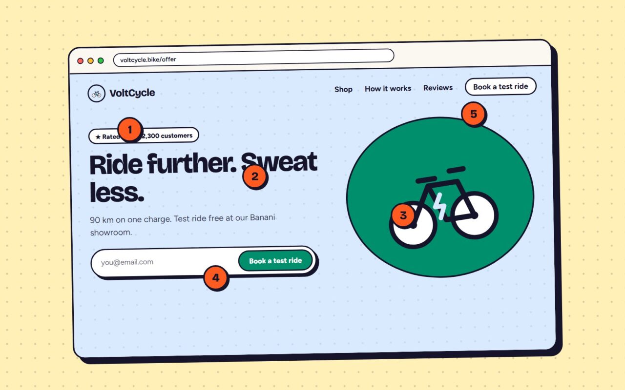
VoltCycle’s ads were fine. The page they landed on was not. Two rounds of testing later, conversions were up 87%.
- Lead with the offer people want: a free test ride, not “buy now”
- One clear call to action above the fold
- Three form fields instead of nine
- Real customer photos instead of stock
- Range and price answered before anyone asks
- Reviews next to the button, not at the bottom
- A sticky booking bar on mobile
- Faster images — the page loads in under two seconds
- A FAQ for the five most common objections
Want us to look at your page? Request a free audit.

Written by
admin